Last modified:
Previously, the chart was called: Solar power chart.
Chart
View the chart at System level in the Evaluation tab in the Section: System.
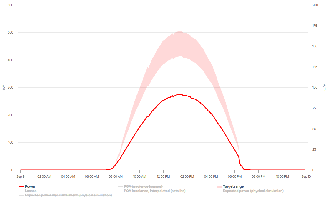
In the example, the light red section represents the Target range where the generated power is expected and ideally should be according to current conditions and set parameters. The darker red line shows the actual generated Power for the system.
Basic info
|
Description |
The chart compares the actual, measured Power/Energy with the acceptable Target range of the expected, simulated power/energy, allowing you to identify deviations between both. Additionally, display the negative deviations from the target range as Losses – which are considered yield losses – and the POA irradiance/irradiation (on module plane). If your system has an irradiance Sensor (recommended), its data is displayed by default. Satellite data can then be displayed additionally. Otherwise, it is displayed by default if no sensor is available. Satellite data is available only with a delay and only in a 5-min interval. This is why you can not display it for the current day. Values between 5 minutes are interpolated. Day view: Additionally, display the exact target value that was simulated for the Expected power – once with curtailments already included and once w/o curtailments. |
|---|---|
|
Prerequisites |
|
Note
Find further information on the general functions within charts under Evaluations & charts.