Last modified:
Previously, the chart was called: Variance analysis chart.
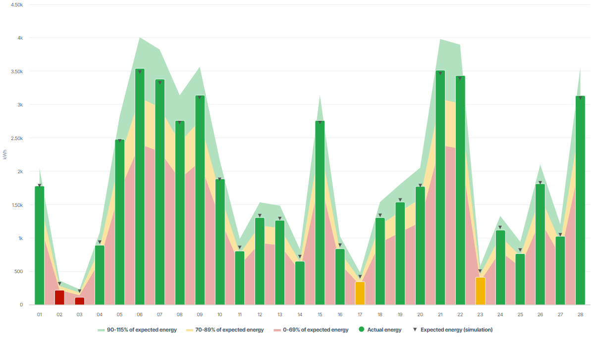
Chart
View the chart at System level in the Evaluation tab in the Section: System.
Basic info
|
Description |
The chart displays:
The exact target value of the expected energy is displayed as single data point. In reference to this data point, the area chart in the background shows three percentage areas of that value in different colors. In reference to these percentage areas, the bars displaying the actual energy are colored depending on the percentage actually measured. Example If the upper end of a bar reaches the green area in the background it will be colored green as well. This means that the system is performing very well. If the upper end of a bar also exceeds the single data point (triangle), the system's performance is even better than expected in the simulation. If a bar is red the system should be checked. |
|---|---|
|
Prerequisites |
|
|
Further details |
None |
Note
Find further information on the general functions within charts under Evaluations & charts.