Evaluations & charts
Last modified:
Charts in the evaluation section provide visual representations of SYSTEM LEVEL data. Which charts are available for your specific system depends on the components and configurations of your system, as well as on your service level and/or additional paid VCOM modules.
Overview of the evaluation tab
To reach the evaluation tab, enter the SYSTEM LEVEL for a system and then select the tab Evaluation, or select ![]() Go to Evaluation right away when hovering over a specific system in the systems list.
Go to Evaluation right away when hovering over a specific system in the systems list.
The evaluation tab is divided into four main areas:
A List of charts that is grouped by category.
The Chart area displays the selected chart in full size. Several functionalities are available here, see below.
The Chart description tells you what you are looking at.
The Chart data and further details of the selected chart.
.png?inst-v=7ecd2927-5901-45e0-b389-9cffc4aa6846)
Main areas in the evaluation section
Functionalities of the chart area
In the chart area, you can adjust your chart view, learn about specific data points, and download chart data and images. The functionalities are listed below:
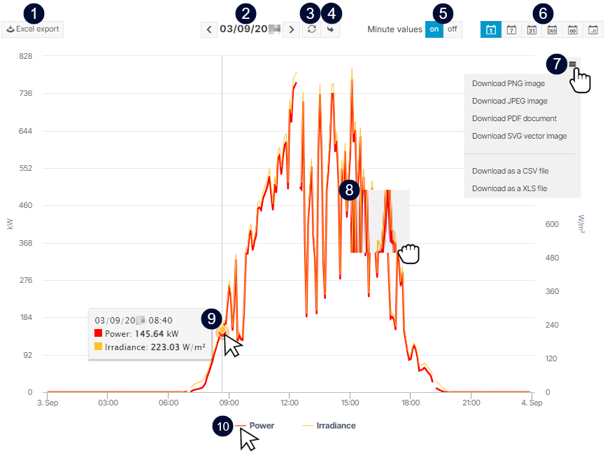
Functionalities in the chart area
Name | Detail | |
|---|---|---|
| 1 | | Quickly download the chart values as an Excel file. |
| 2 | Time | Select the time you want to display. It depends on your Period settings whether this is, for example a specific day or a year. Choose specific dates or refine user-defined time in the Calendar above the chart description. |
| 3 |
| Update the chart view, for example after changing the time or period. |
| 4 |
| Jump to the current time. It depends on your Period settings whether this is, for example a specific day or a year. |
| 5 | Minute values | Turn on to display the chart in a 1-minute resolution. Prerequisites:
Examples Scenario: You data logger and inverter A support 1-minute values, but inverter B does not. Use case 1: You want to display the AC current of inverter A and B in minute resolution. Use case 2: You want to display the AC current of inverter A in minute resolution and the temperature at the same time. |
| 6 | Period settings | You can change the period of the displayed data. Choose between day, week, month, year, total, or user-defined view. Note
|
| 7 |
| Choose from various formats to download the chart or its data. |
| 8 | Zoom in | Drag the mouse over an area to zoom in on a specific section of the chart. |
| 9 | Data points | Hover over an area to display individual data points and their values. |
| 10 | Highlight item | Hover over a measured value in the legend to highlight the corresponding data point in the chart. Select and deselect measured values to change their visibility in the chart. |
Customize chart colors
Customize the appearance of charts with the chart colors feature.
Prerequisites
Service level PREMIUM PARTNER
Admin rights
Steps
At PORTFOLIO LEVEL, go to
.png?inst-v=7ecd2927-5901-45e0-b389-9cffc4aa6846) Administration >
Administration >  Customization > Design > Chart colors.
Select one of the pre-defined color palettes.
The color palette is now applied to almost all charts in the ![]() Evaluation section for all users and all systems in your portfolio.
Evaluation section for all users and all systems in your portfolio.
Note
The Chart colors feature does not apply custom chart colors to the Self-consumption chart, the Performance ratio comparison chart, and only to the values of PV yield of the Performance ratio (PR) chart. See specific chart details for further customization of these charts.
Chart configurations
To adjust chart settings, access the SYSTEM LEVEL, go to ![]() System configuration >
System configuration > ![]() Calculations.
Calculations.
For more information on how to do that in particular, read about the individual charts: