Last modified:
Chart
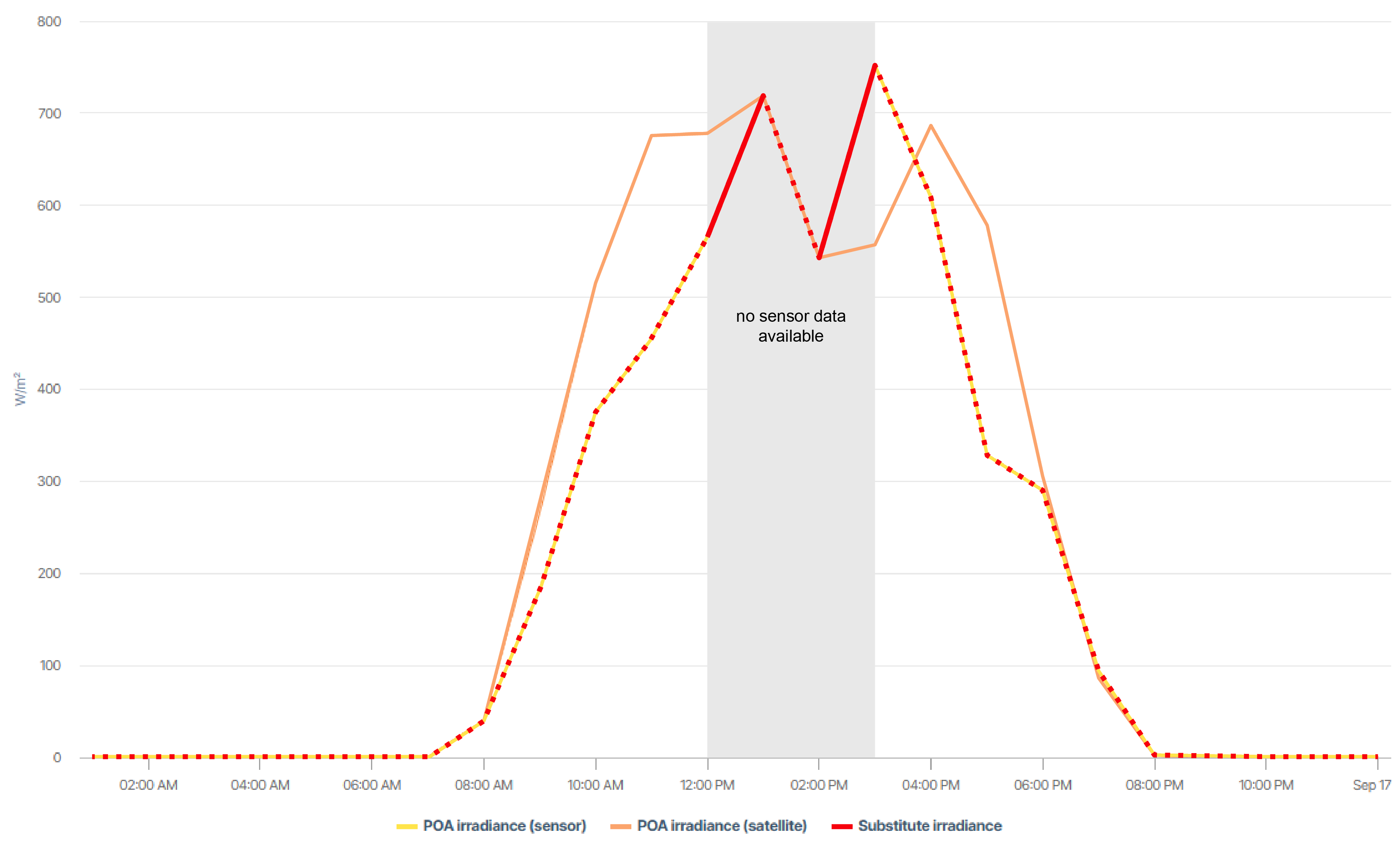
View the chart at System level under Evaluation.
In the example, the red line displays the substitute irradiance that is taken into consideration. As long as sensor data is available for POA irradiance (yellow line), the substitute irradiance equals that. As of 12:00 pm the sensor fails, and irradiance data is not available until 03:00 pm. For this period, satellite data (orange line) fills in the gap.
Basic info
|
Description |
The Satellite data chart compares POA irradiance/irradiation data (on module plane) from your sensors with satellite data, allowing you to detect defects or irregularities.
|
|---|---|
|
Prerequisites |
|
Note
Find further information on the general functions within charts under Evaluations & charts.