Last modified:
Create a user-defined chart or heatmap
-
User group customer or higher
-
premium partner only If you belong to a user-defined user group, the View and Create permission of the user group module Evaluation must be allowed for it. See User group modules and permissions.
-
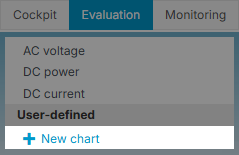
At System level , navigate to the

-
Select

-
Choose the type of Chart you want to create:
-
A) Standard Chart
-
B) Heatmap
-
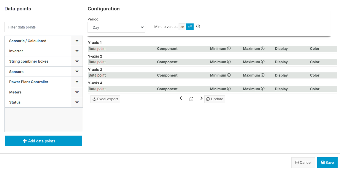
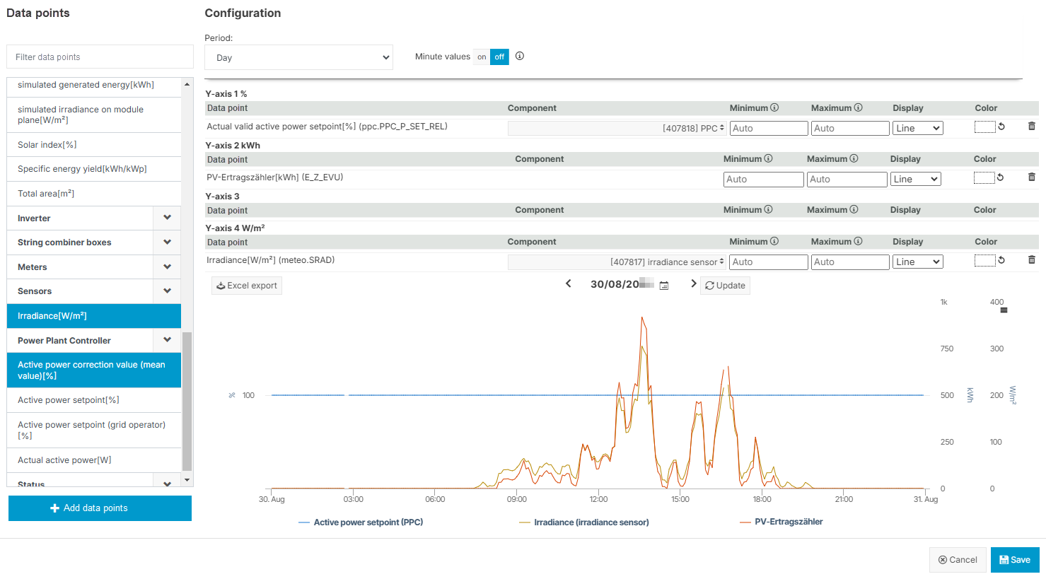
A) Configure a standard chart
-
Under Data points, select all data points you want to compare. Select the values one by one, and your selection is then highlighted. Filter the list by typing the name of a desired data point in the search bar. Your previous selection will remain. Deselect a value by clicking on it again.
Note
Find your user-defined terms in the category Sensoric/Calculated. The names of user-defined terms are not translated into multiple languages.
-
Select
-
Select the Component you want to compare for each of your data points.
-
Select
.png?cb=11037feafab5e551e0d1793aebc42a35)
-
Adjust the chart as follows:
-
Period: Select the type of period (day, week, month, year). For Day period, you can also activate the toggle Minute values if the prerequisites are fulfilled, see also Prerequisites for minute values.
-
Display & Color: For every data point, set a specific type of appearance (line, column, area, or point) and choose a color for the graph.
-
Y-axes: For every y-axis, set a custom scale by entering a Minimum and/or a Maximum value. The scaling values for all data points that are allocated to the same y-axis will synchronize. After updating the preview, the scale of the respective y-axis will adjust close to the values you entered, while maintaining the intervals of the original axis – so sometimes it will not start or end at the exact value you entered. Note that there is no validation of the scaling values with the data points – if the latter are out of the scaling range, they will be cut off in the visualization. Switch back to automatic scaling by deleting the scaling values.
-
-
Confirm every adjustment by selecting
-
Select

-
Give your chart a title and select
Your new chart is now listed permanently in the category User-defined and visible to every user who can access the respective system. Select it to display it in full size.
Further actions-
After saving your chart,


B) Configure a heatmap
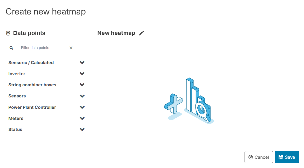
-
Under

-
If applicable, a
.png?cb=12102cf9ad8b8bc5c973d4c89009819a)
-
Give the heatmap a name by selecting
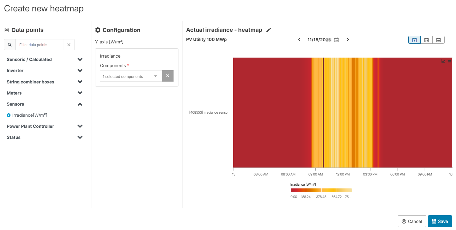
-
Select
Your new heatmap is now listed permanently in the category User-defined and visible to every user who can access the respective system. Select it to display it in full size.
Further actions-
After saving your heatmap,