Solar power chart
Last modified:
Chart
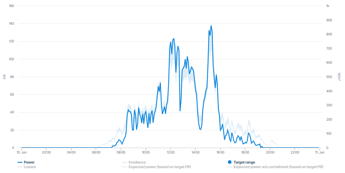
In the example, the light blue section represents the Target range where the generated power ideally should be. The darker blue line shows the actual generated Power for the system.
Solar power chart in Day view
Basic info
Description | The solar power chart compares the actual, measured Power/Energy with the acceptable Target range of the simulated, expected power/energy, allowing you to identify inconsistencies between both. Optionally display the negative deviations from the target range as Losses - which are considered yield losses - and the Irradiance/irradiation. In Day view also optionally display the exact target value that was simulated for the Expected power - once with curtailments already included and once w/o curtailments. |
|---|---|
Prerequisites |
|