.svg)
Last modified:
Previously, the chart was called: VCOM forecast or Solar power forecast.
Chart
View the chart at System level in the Evaluation tab in the Section: System.
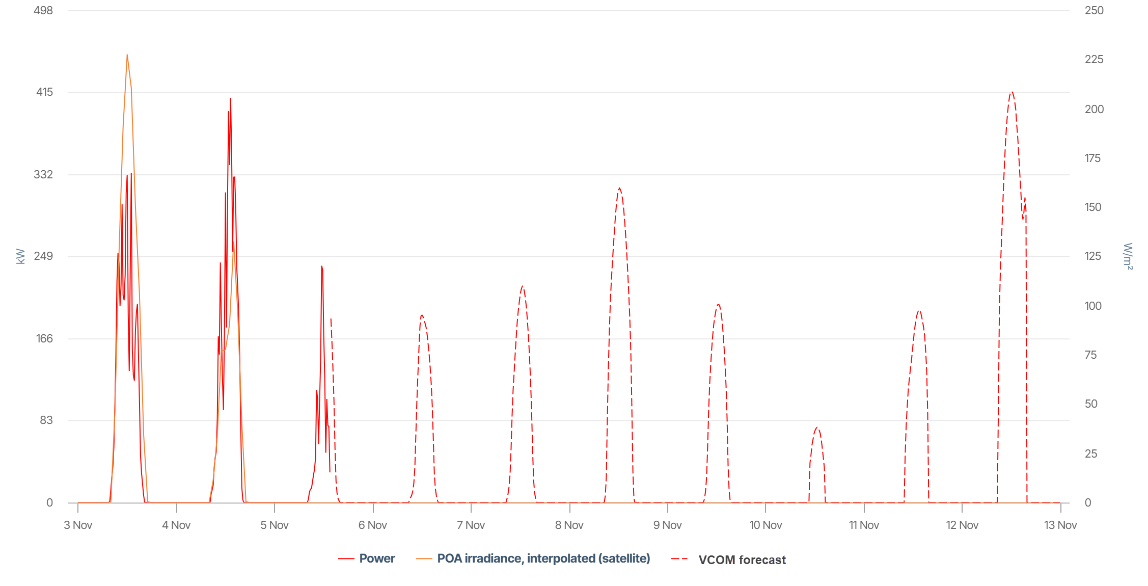
The chart shows:
-
Dotted lines: Forecasted power in kW for a 7-day horizon (here: 6-13 November).
-
For comparison, you can see the actual power in kW (red line) and POA irradiance (yellow line), in this case for 3-5 November.
Basic info
|
Description |
Shows forecasted active power based on VCOM Forecast, including the current day and the next 7 days, updated in 15-minute intervals. VCOM forecast combines weather data, data from physical PV systems, and machine learning trained on site-specific characteristics to provide highly accurate predictions. The chart also shows real-time measurements of actual power and satellite irradiance, as well as past forecasted power. |
|---|---|
|
Prerequisites |
|
|
Further details |
The intervals displayed may deviate for data sources with faster or slower transmission intervals. See VCOM Forecast for technical details. |
View historic values
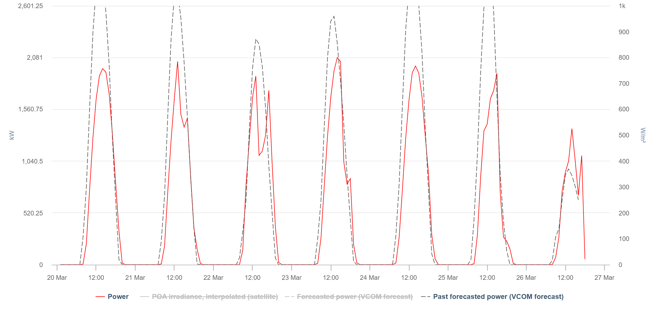
You can view historic forecast power values in a daily or weekly view. You can use this, for example, to evaluate the accuracy.
The chart shows:
-
Gray dotted lines: Forecasted power in kW from the past 7 days
-
Red lines: Actual power in kW
Note
Find further information on the general functions within charts under Evaluations & charts.