.svg)
Last modified:
You can configure the following parameters when creating or editing a user-defined standard chart. See Create a new user-defined chart.
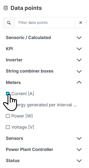

Data points
-

-

-


-
Find your user-defined terms in the category Sensoric/Calculated. The names of user-defined terms are not translated into multiple languages.
-
Selected data points are immediately added to the
.png?cb=12102cf9ad8b8bc5c973d4c89009819a)
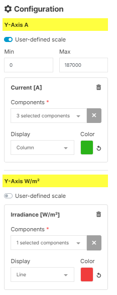
Configuration
-
All data points with the same physical unit are allocated to the same y-axis. A data point with a different unit than the previously selected ones is allocated to a new y-axis. Four y-axes are possible.
-
Select

-
For every y-axis, you can set a

Enter. The scaling values for all data points that are allocated to the same y-axis will synchronize. The respective y-axis will adjust close to the values you entered, while maintaining the intervals of the original axis – so sometimes it will not start or end at the exact value you entered. Note that there is no validation of the scaling values with the data points – if the latter are out of the scaling range, they will be cut off in the visualization. -
If applicable, select the system’s Components you want to be displayed in the chart, for example, a certain inverter.
-
Display & Color: For every data point, set a specific type of appearance (line, column, area, or point) and choose a color for the graph.
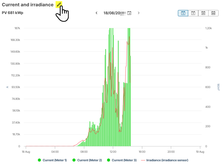
Preview
-
Select

-
Select the type of period (Day, Week, Month, Year). In the System diagram portlet, the chart is displayed in the selected period. When selected in the Evaluation tab, the chart is initially displayed in the period of the previously displayed chart.