.svg)
Last modified:
Previously, the chart was called: DC Heatmap inverter strings.
Chart
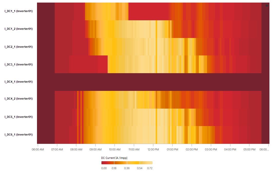
View the chart at System level in the Evaluation tab in the Section: Inverter inputs.
In the example, string 1 of MPPT 4 of inverter 01 is marked in dark red since no normalized current is measured or available for that input.
Basic info
|
Description |
The heatmap allows you to monitor the normalized DC current of each string of each inverter’s MPPT individually. Bright yellow areas represent the daily maximum. This may vary over the course of the day. Areas shown in dark red correspond to strings for which no values are measured or available. |
|---|---|
|
Prerequisites |
|
|
Further details |
|


Note
Find further information on the general functions within charts under Evaluations & charts.