Chart generator for savable charts
You can compare individual measured values and generate charts for your specific needs at the system level. Furthermore, you can save all your charts for later use and even view them again after a re-login.
Notes
Savable charts are user-specific. So only the user who generates a chart can see it in the list of evaluation charts.
You can only compare measured values that are already available in VCOM. These values come from your data logger.
Create and save a new chart
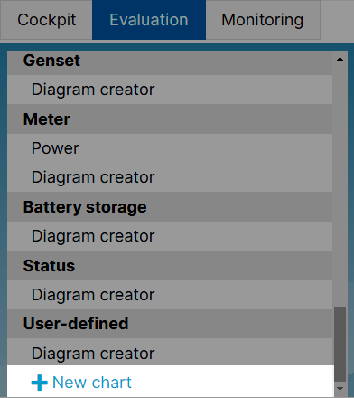
At system level, navigate to Evaluation. Scroll to the end of the list of charts to the category User-defined.
Select
 New chart. A pop-up window will open.

You find the savable chart generator in the category User-defined.

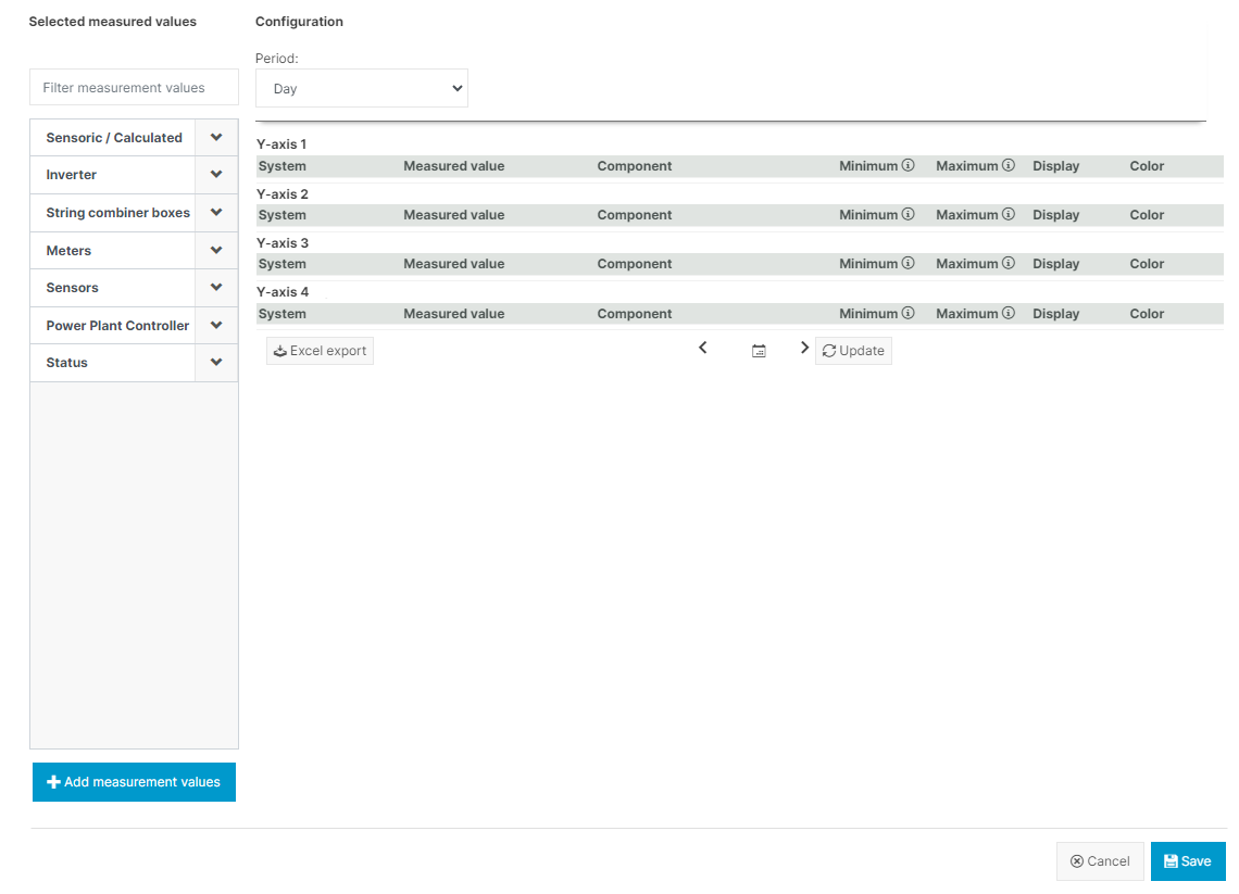
The options to generate a user-defined, saveable chart.
In the list on the left, select all the values you want to compare from the dropdown menus of the corresponding categories. You can select the values one by one and your selection will be highlighted. You can also filter the list by typing the name of a desired value in the search bar above the list. Your previous selection will remain. Deselect a value by clicking on it again.
Select + Add measurement values. All your selected values will appear on the right side and will be allocated to one of four possible y-axis, each representing a different physical unit.
Select the components you want to compare for each of your measured values in the corresponding dropdown menu.
Select
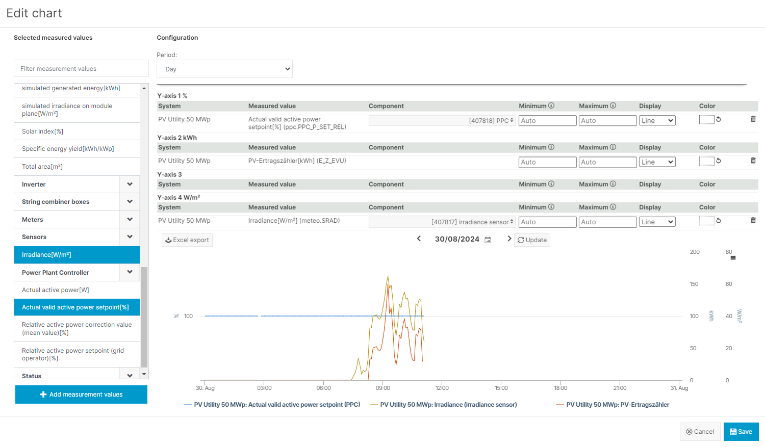
 Update. You will see a preview of the chart at the bottom of the window.

After you have added all measured values and selected the corresponding components, you can generate a preview of your chart.
You can configure the chart as follows.
Period: Select the type of period (day, week, month, year) in the upper area of the screen. Choose a specific date or time span on top of the chart preview.
Appearance: For every measured value, you can set a specific type of appearance (line, column, area or point) and choose a color for the graph that is displayed in the chart.
Y-axes: For every y-axis, you can set a custom scale by entering a minimum and/or a maximum value. The scaling values for all measured values that are allocated to the same y-axis will synchronize. After updating the preview, the scale of the respective y-axis will adjust close to the values you entered, while maintaining the intervals of the original axis – so sometimes it won’t start or end at the exact value you entered. Note that there is no validation of the scaling values with the measured values – if the latter are out of the scaling range, they will be cut off in the visualization. Switch back to automatic scaling by deleting the scaling values.
Confirm every configuration by selecting
 Update.
Select
 Save. Give your chart a title and select
  Save again. Your chart will then be listed permanently in the category User-defined.
Select your chart from the list of evaluation charts to display it in full size.
Further action
Edit or delete a saved chart
Navigate to your saved chart in the list of charts.
Hover over your chart title and select the
 Settings menu at the end of the line.
You can edit, rename or delete your chart.
.png)